Stop Disrespecting Fallout 4 with Starfield

There’s a lot of talk about Fallout 4 since people got to play Starfield. Reviewers are comparing the two, saying Starfield is Fallout 4 in space. But there’s an issue with that, it’s not at all.
The games share similar gameplay and are on the same engine. Besides that they are different. Many reviewers have listed the issues with Starfield and these issues are not the same as Fallout 4.

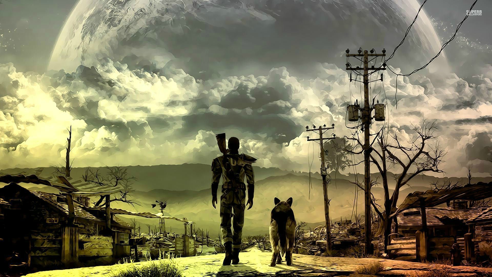
Fallout 4 was really good and had issues. It was a land of stories with great exploration and memorable characters. The main story had issues but was still decent. The lack of choice was an issue but it made up for it in other ways. The game had a lot heart and so much detail.
Starfield doesn’t have that and it’s just meh. The game takes elements from No Mans Sky, The Outer Worlds and Star Citizen and they’re halfway done. The planets are just generic with bases on them. They don’t have any alien or unique look. The ships and suits rip off Star Citizen and several of its story elements.
The writing is basic and pointless. People are talking but no one is saying anything. No one has mentioned the fact that they’re no voiced main character. At least give us the option of turning it off or on. One thing I liked about about Fallout 4, is when talking to someone, if you move the camera to one side of the screen and hold it, it’ll go into a free look 3rd person camera. In conversation, they’ve taken The Outer Worlds type camera.
Graphically, it’s ok not mind blowing. I’d say the graphics are worse than Fo4. It doesn’t help on planets a lot of textures are brown and gray. I don’t have an issue loading before you go inside a building. Character models and textures seem to be worse as well, it’s like they’re over sharpened and noisy.
The flying planet to planet system says we don’t care. I wanted to fly to Alpha Centauri and was boosting my jets, but it never got closer. Then I realized I have to look at the and press a button to go to it like fast traveling. To land you have to select a zone and press a button. The initial tutorial makes you go a step further and have to go into its star map and then select a landing place.
The menu system is another regression, It’s clunky and unintuitive. It’s a pain to even select a new weapon. You’d think when you got the watch, you could use it like a Pipboy and quickly select what you need, no.
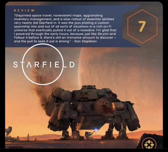
Wheather it’s unfinished or not, it doesn’t matter. The game was good at making space boring. The people complaining about other sites giving it a 7/10 shouldn’t be. Those sites are biased towards Xbox and the scores are generous. For me its a 5 /10, boring, regressive and generic.


